Showing posts with label Kits. Show all posts
Thursday, July 1, 2010
Just A Rant On The New Home Kit
by Rachid
Above is a picture released yesterday of some of our players modeling our new kit. Looks as boring as I expected it to, to be honest. It looks like a training kit at best. Why the socks have no design but the Nike Swish is beyond me and what's even more bizarre to me is the reaction from many regarding it as 'fantastic', 'marvelous' and 'a dream'. What I've noticed also is that the only people who seem to love this kit are the English fans but every international fan of the club that I've spoken to that's seen it has said it looks boring, bland and unfinished.
What's there to like about this kit? Yes we've gotten back the traditional white sleeves but the red trim on it leaves a whole lot to be desired. It looks so feminine and Tomas Rosicky, who already looks like a lesbian, will look even more girly now. I'm not pleased because minus the broken collar and the gold streaks down the sides, this kit is no different from our kit in our first season at The Emirates, as shown below:
Even this kit was better because the trim on it was nicer and of course the gold streaks added a nice touch. If they felt that this needed those features back then, why do they suddenly feel that it needs nothing at all added to it this season?
Many of those who like this kit like it for the reason that it's bringing us back to our roots. I can understand that but it annoys me that every season we unveil a new kit we claim to be commemorating something. My problem with this is that when you spend every season commemorating something, it takes away from the value of the tribute. It's kinda like when you see couples foolishly celebrating every month they've been together. What's the magic in it if it doesn't happen every once in a while?
Why do we always have to be commemorating? It seems like just an excuse when whomsoever's designing the kit can't come up with anything aesthetically pleasing. We keep releasing boring kits season after season now and how can you expect a kit that was worn way back in 1971 to look relevant in 2010? That's just totally fucking ridiculous! I don't see any reason why we couldn't have paid homage to the team of 1971 with a kit that looks like theirs but also has some more modern touches and designs on it.
I think it's rude of Arsenal FC to expect us to pay £40 for this very bland, boring and done design. What do you think? Let me know in the comments below. Cya next time, Gooners.
Monday, June 28, 2010
Have A Look At What Might Be Our Fugly New Home Kit
by Rachid
Annoyed, disappointed, underwhelmed. Just a few words that come to mind when I look at this ugly new kit that's supposedly ours as of tomorrow that I found on EPL Talk. God I hate it! The sleeves have such an ugly trim and the design on the torso is so bland and boring. Why did we take this long to release this kit? The design (or lack there of) of it looks like a template at best. I think the bold trim on the sleeves also makes it look a bit too feminine for a bunch of men to be wearing. Here are a couple more shots of it, if your eyes can bear the pain.
It's not confirmed that these are authentic but they definitely don't look photoshopped to me. Anyway, leave a comment and let me know if you find it as horrid as I do.
Until next time, dust.
Thursday, June 17, 2010
More Thoughts On The New Kit
by Rachid
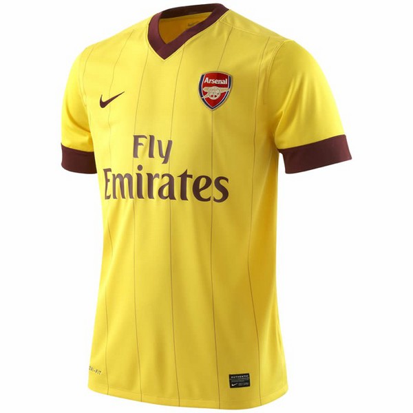
If you read the last post on this blog you'd have seen me saying I love our new away kit because of the design and the colour of it. My views have since changed. When you look at a picture of the kit at first glance you'd think it has pinstripes. This was one of the main reasons I loved this shirt when I first saw it. It made it look unique and also modern. I'm tired of seeing Arsenal trying to rehash old jerseys and it annoys me to hear the stupid, old, fuddy duddy geezer fans who can't let go of the past raving about how cool these designs are. This is 2010, not 1971. I want to see a kit that fits our era. Not some outdated shirt that looks like it should be worn with a Beatles styled mop top.
Unfortunately though, I saw a video yesterday with the players wearing the kit and it seems that what I thought were pinstripes were actually stitches in the shirt. Also, the long sleeved version looks even worse. It looks so old and outdated, as if it was made 60 years ago. When you have a look at it as it in the video it actually looks a lot like the white away kit we wore 2 years ago except, it's of course, yellow. Here's the video so you can see for yourself:
Now that you've seen it in a real life shot, what are your thoughts on it? Have your views changed, like mine? Have your say in the comments section below.
Dust!
Monday, June 14, 2010
A Glimpse At Our New Away Kit
by Rachid
Well here it is. This is supposedly our new away kit for next season. I have to say I am really loving this. The choice of yellow and red currant looks classy and it's made even better by the trim around the sleeves and the pin stripes. I'm a big fan of this kit and I'll be getting one as soon as I can. Will you? Give me your thoughts on it in the comments section.
Check back tomorrow for a look at the new home kit. Until then, dust!
Subscribe to:
Posts (Atom)